Sports Graphics
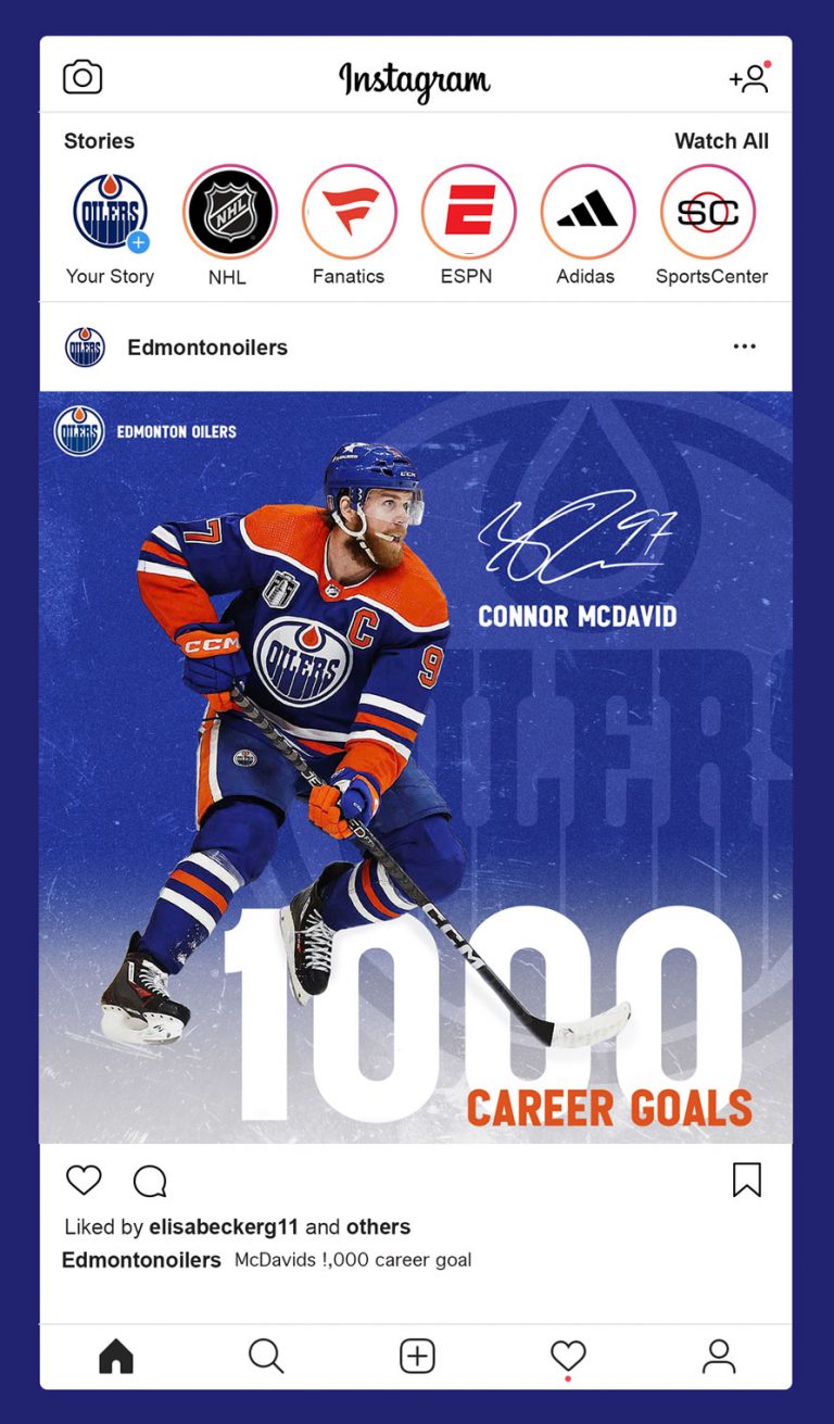
This project was just for fun. Other than football the only sport I watch is hockey. As a fan I constantly see instagram posts with similar graphics from every major league sports team and wanted to take a stab at it. While both designs are made for instagram they are for two very different teams with very different styles. The Edmonton Oiler post focusing on one player needed to be dynamic and more dimensional. An action shot that interacts with the text and the textured background including their logo worked really well for their design. The player signature is the cherry on top.
Edmonton Oilers
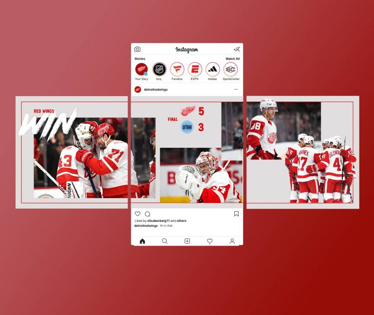
Detroit Red Wings
The approach for this design was a bit different. Most of the Red Wings graphics are clean and focused. I decided to create a carousel post for them because it keeps viewers engaged and something they seem to do consistently. This is a win announcement post so overlapping various moments from the game and including the final score was entirely necessary. Having elements like the WIN, and players pictures break the boundary of the red box keeps the design from being too clean cut but still on brand for the Red Wings.